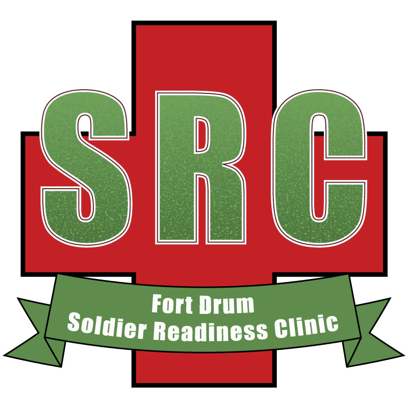
When initially creating my draft logo, I began by sketching some ideas on paper. Initially, I wanted to create a general Army Medicine logo. Then, it occurred to me Army Medicine already has a logo. Why recreate the wheel. So, I decided to focus on a more specific topic within my organization. After making a few sketches, I decided to make a logo for a department at my clinic which doesn’t have their own logo but is a staple of our installation.
Before deploying and upon returning from deployment, all soldiers must go to the Soldier Readiness Clinic to ensure they are medically ready for the fight. So, working on a logo for the SRC seemed like a step in the right direction.
I started the logo by creating a new Illustrator document at 800 x 800 pixels. I then made a couple of color swatches based on the colors of our already branded material from my clinic (a specific red and green).
I then used the green to create a background with rounded edges. I then copied the background and used the gradient tool to create a radial gradient on the copy and lowered the opacity to 30% to give the green background a shadowy look. Next, I created the SRC portion of the logo using the Bauhaus 93 font at 325 pt.
After working through the design a little bit, I decided to change the font to Impact as I believe it gave the design a little more of a professional look. Next, I used what I learned in the Varsity Lettering tutorial to create a pointalized gradient effect in the lettering. Next, I added a white stroke and made it 9 pt.; then I added a second stroke and made it 2 pt to give it a border within a border look.
Next, I began working on the spelled-out portion of Soldier Readiness Clinic. I took what I learned from the banner tutorial and made a banner using the red swatch I created as a background and having a black border at 3 pt. I then chose Arial Bold as the font and used 47 pt. weight.
Finally, I copied the banner and moved it down to the bottom. I then changed the fill to white and the stroke to the red swatch and changed the words to “Fort Drum, New York.” After ensuring the entire thing was grouped, I scaled the size down a bit and put an arch on the banner at -25%.
After finalizing my logo, I realized I might want to go in a different direction. So, I decided to save this logo as DRAFT1 and make some changes. I got rid of the lower banner and replaced it with a rectangle box of the same color with the web address in it. I also scaled up the vertical size of the upper banner and put the words “Fort Drum” on top of “Soldier Readiness Clinic” and added a -15% arch to that banner.
My draft assignment now had two similar products with some slight differences.
Next came completing my final design. After reading through some of the suggestions from my feedback, I realized I might be making my design a little too complicated. Some of the suggestions I received which I wanted to incorporate in my final design were to include a heart logo, including a medical cross, to get rid of some of the words, making the color of the wording the same as the SRC, removing one of the banners, and trying to think about the effectiveness of my logo on something as small as a patch or t-shirt.
With my feedback in mind, the first thing I decided to do when editing my design was to get rid of the background completely. I then changed the color of the text and banner from my clinic’s branded red to our branded green.
The next step was to make something to complement the SRC text. Being that the SRC is a medical clinic, I went with the standard Red Cross as a background. I used the rectangle tool to create the first part of the red cross. I then copied the shape, rotated it 90 degrees and placed it in the center of the other shape. I then used the shape builder tool to merge the two rectangles to finalize the red cross.
I then put a 9-pt. border on the cross to help separate it from the text and made the SRC text larger (307 pt.) to make it fill the space a little more. Finally, I put a slight arch on the banner to make the logo look a little less “boxy.”

