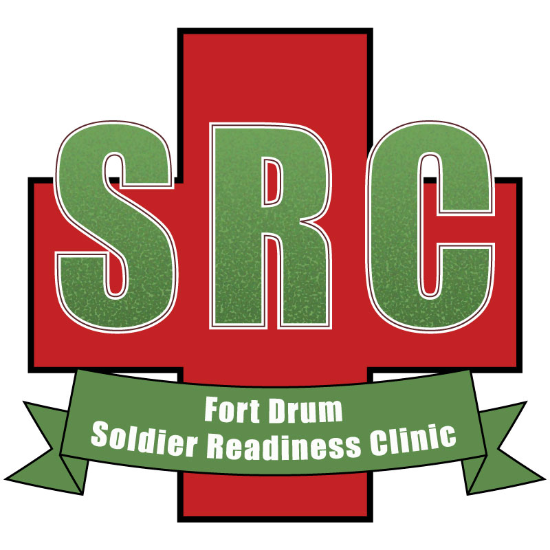
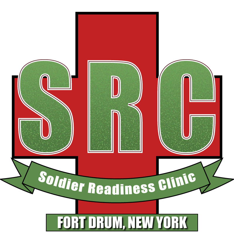
For my final reflection assignment, I decided to revisit my logo using Adobe Illustrator. I wanted to revisit this project for two reasons.
One, it was the project I received the lowest grade on, so I wanted to beef it up a bit. Secondly, out of all the Adobe programs I use, Illustrator is the one I’m the least proficient at, so I wanted to get better at it.
The SRC logo is important because the clinic plays a major role in the readiness of Soldiers with the 10th Mountain Division, the division my organization supports. If I were to use this logo, it needs to be recognizable to those who utilize the clinic on a daily basis. I would use it to brand the SRC and highlight what the clinic is doing via social media and other digital means.
The first thing I did when making improvements to the logo was to separate “Fort Drum” from “Soldier Readiness Clinic.” I then adjusted the size of the banner to match the single line of text and adjusted the warp. It tweaked around the position a bit to make it look like it’s hanging from the bottom of the first aid cross.
Next, I used the rectangle tool to add a new rectangle at the bottom of the logo. I changed the fill color to the same green used in the banner and added a black border. I then added the words “Fort Drum, New York” and added a drop shadow to the text.
Thank you for taking the time to revisit my logo project. I hope you enjoy it.

