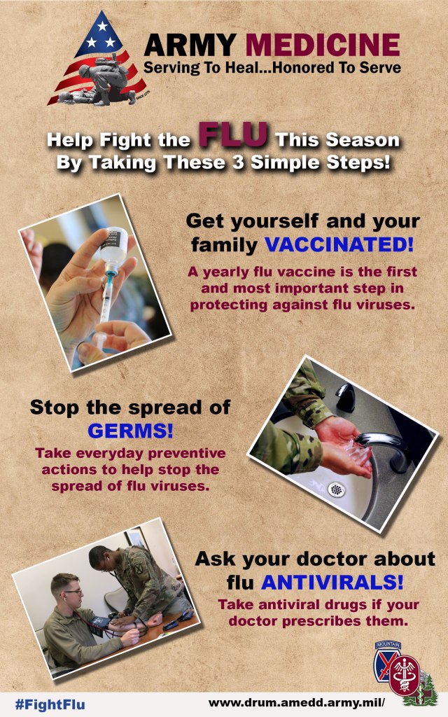
For my design, I decided to provide some information about how to combat the flu this season. Given that my topic is Army Medicine, and with the flu being so prevalent in the news lately, I figured this would be an excellent way to share an important topic with my audience. It’s designed to be informative while not being filled with so much information the reader loses interest.
I wanted my design to be simple while at the same time attracting the reader’s attention. I drew my information directly from the CDC website on the three tips to help combat the flu, which can be found here: https://www.cdc.gov/flu/prevent/prevention.htm.
The three photos are public domain photos downloaded from the Defense Visual Information Distribution Service (DVIDS) and depict an Amy Soldier or medical professional (two of the photos are mine I took for work). The text boxes with the steps are matched up with the picture beside it to ensure both work together. For all three photos, I utilized a border following the same steps in the cutouts and blending modes Photoshop tutorial. I opened each photo individually, added a new layer, used the paint bucket to fill in the layer black, used stroke in the layer style box and changed the size to meet the needs, changed fill to 0%, and saved the photos as JPGs before using place embedded to add them to my design.
Next, I used the Transform – Rotate tool in the edit menu to tilt each photo slightly. I also included a drop shadow from the layer style box on each photo. For my background, I decided to use a simple design from Pixabay.com, which is free for commercial use and no attribution required. I needed a background where all the elements would work on top of without flushing anything out.
For the logos, I used the official Army Medicine logo on the top and on the bottom right a design I made, which incorporates the 10th Mountain Division Patch, the Fort Drum Medical Activity Logo, and the Army Medical Command Patch. Each element was used to help with the branding of the design. I also included a link to our webpage as well as a hashtag others can use when sharing.
When designing the text, I went through a few different ideas before landing on one I felt was visually appealing while at the same time easy to read. I changed sizes, type and weight until I came up with the right design that would pop and be readable. For the top line of text, I also added a drop shadow using the layer style box. All drop shadows use global light so they all match in direction.
Throughout the entire process, I used the move tool to shape and resize the images and text to ensure they fit on the page logically.
For this design, I wanted to target Soldiers and their families. While it’s a requirement for Soldiers to get a flu shot every year, it’s not for their family members. I wanted to design a product that would be easily understandable to anyone reading it while at the same time grabbing their attention.
Photo and Graphic Credits:
“Army Medicine Graphic”, courtesy graphic, public use. https://armymedicine.health.mil/
“Army Medics” , by Warren W. Wright Jr., Fort Drum Medical Activity, public use. https://www.dvidshub.net/image/5283702/fort-drum-nurses-medics-get-hands-during-nursing-skills-fair
“Fort Drum MEDDAC 3 Patch”, design by Warren W. Wright Jr., Fort Drum Medical Activity, public use.
“Hand Washing Photo”, courtesy photo, 21st Space Wing, public use. https://www.dvidshub.net/image/5761746/support-mission-wash-your-hands
“Paper, Old Texture”, by Chris Fiedler, Pixabay, free for commercial use. https://pixabay.com/photos/paper-old-texture-parchment-1074131/
“Syringe Photo”, by Warren W. Wright Jr., Fort Drum Medical Activity, public use. https://www.dvidshub.net/image/5283711/fort-drum-nurses-medics-get-hands-during-nursing-skills-fair


Thank you for this creation. This is hard for me to critique because it looks very good. I will start off though with saying the word “FLU” at the top is too dark. Everything stands out in this picture except the dark FLU. It is larger which helps it stand out, but because it is so dark next to white I think it gets lost. Maybe you can make the rest dark and the word white or find another way to make it stand out more.
The other recommendation I have might not be as much photo shop but I noticed it and so I think it is ok to mention it as a change. The top letters in all of the words are capital except in, “Help Fight the Flu” The word “the” should be capitalized. It distracts me noticing everything else is capitol. This is a very easy fix. If the other small words such as “by” weren’t capitalized I wouldn’t mention it but it seems it is the only word that isn’t capitol.
This is one of the best-looking posters I have seen. You changed the colors of the words to make them stand out. As you said there is not too much information for the audience to get lost but enough to get your point across. The pictures with the borders and the shadow really caught my attention. Also the way you rotated them works great with this picture. Thank you and great job!
LikeLike
I really liked how you used different colors to highlight specific key text. I believe the images really help to communicate the main points of your message. You achieved visual unity and intellectual unity with the consistent image and text. The background provides a nice contrast and makes the text stand out. I believe that the border and the drop shadow really enhance the look of the image. I believe the drop shadow takes away from the text. Currently there are two logos, are they for two different organizations? I do like the use of analogous colors for the text, blue and purple. What are your thoughts on reducing the saturation of the middle image? Another recommendation would be to make the title of the image the same color as you are using color to contrast in the supporting text. What is the first thing you want the viewers to see? Currently the first thing I notice is the action to help fight the flu by taking 3 simple steps text.
LikeLike
Hi Warren, thank you for your service! Your design is very well developed, the message is clear, and the design is well thought out. I specifically enjoy that you included the hashtag on the bottom corner of your poster. This is something I think I will add to my design. I also enjoy your use of red, white and blue in your design. These colors have a strong meaning in our culture.
Your design is well developed, which is wonderful, unfortunately I do not have many ideas for improvement. Here are a couple of minor things to consider. I think a nice touch to your design would be to include a number for each step. (i.e. #1. Get yourself and your family vaccinated, #2. Stop the spread…) Adding numbers would draw the viewer through the 3 steps that you mention on the top. Your background looks like a bulletin board, it would be interesting if the photos were somehow “pinned” to the background, perhaps small tacks in the corners.
Nice job! -Rachel
LikeLike
I can’t believe this is a draft. This is a perfect,succinct, quintessential informative health poster. The use of different colors and sizing in the text brings attention to the important points without being distracting. The images work well and the muted background color is a great basis to build on. The inclusion of links and army emblems on the bottom really serve it well. I think this will be highlighted to future students as a great example of what to do.
LikeLike
What can I say about my personal critique of my graphic design draft? While working on my design, I must have gone through a dozen ideas before the one I posted came to be. I’m not the most creative person in the world (I tend to think of myself more as a technical person than a creative one). However, that being said, there are a couple of things I think I can do to make my design a little better. First, I believe the Army Medicine logo at the top might be a little too large, taking up too much attention from the rest of the design. Secondly, I think having both the Army Medicine logo and my individual clinic’s logo might be confusing to those who don’t have an understanding of military medicine. However, I think my intended audience would understand, so I’m not sure if I should change it by getting rid of my clinic’s logo or not.
I do like some of the critiques I received on this from my peers. First, I like the idea of putting pins in the photos to make them look like they’re pinned to a board. I think it would add an element of creativity to the design. Secondly, I really liked the idea of numbering each tip. I think this will help the reader understand the separation and the hierarchy of each tip as the top being most important and the bottom being the least. I also plan on working on the top text to make it more readable and consistent.
Overall, I’m proud of the work I did. For not being very creative, once I got on a roll, the design just seemed to come together. I think it’ll go a long way in helping people understand the value of fighting the flu.
LikeLike