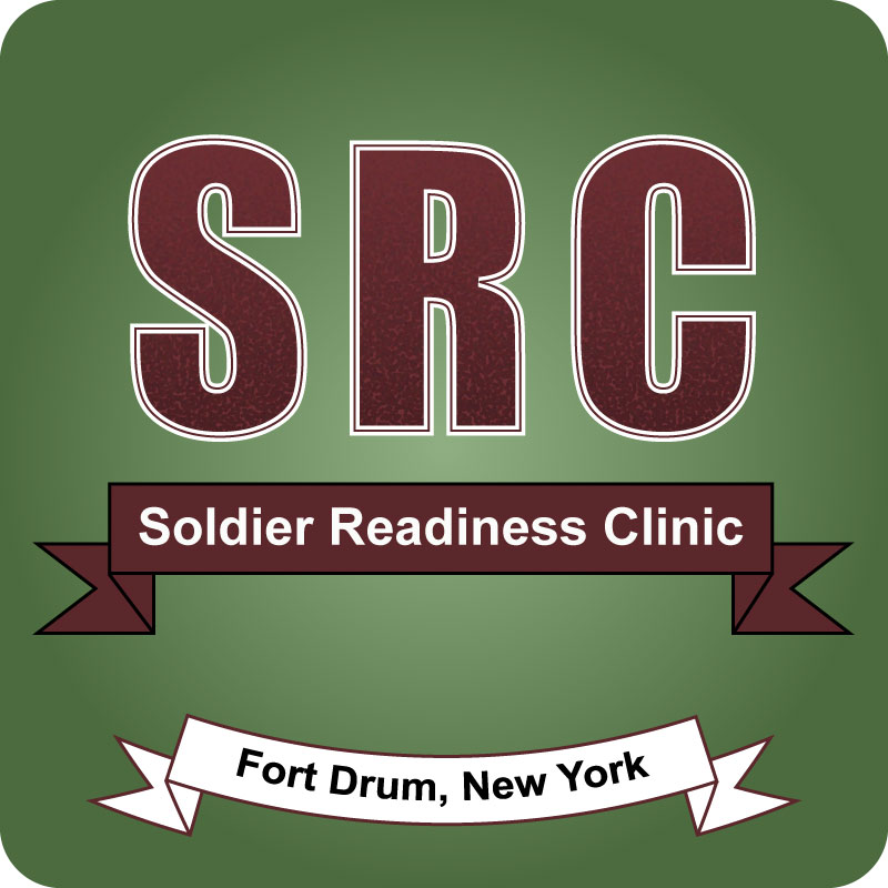
When creating my draft logo, I struggled a little bit more than I did when using Photoshop to create my graphic design project. I have a lot of experience using Photoshop, specifically with touching up photos, but I have zero experience with Illustrator. While I think the tutorials were fun and gave me a good understanding of how to use Illustrator, the topics covered in the tutorials didn’t do much to help me come up with a good idea for a logo.
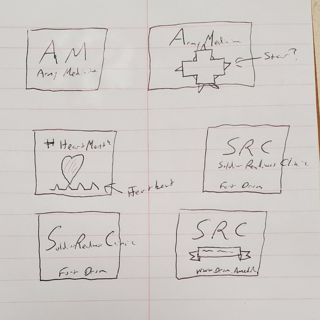
When I began to sketch some ideas (as noted in the sketch photo above), I started working toward making a general Army Medicine logo. Then, it occurred to me; Army Medicine already has a logo. Why recreate the wheel. So, I decided to focus on a more specific topic within my organization. Being that February is Heart Health Month, I began to work on a plan to create a logo for Heart Health Month. Still, again, I realized there were already a lot of branded things out there for that (plus making a heart in Illustrator seemed a little beyond my expertise at this point).
I next decided to work on a logo for a department at my clinic which doesn’t have their own logo but is a staple of our installation. Before deploying and upon returning from deployment, all Soldiers must go to the Soldier Readiness Clinic to ensure they are medically ready for the fight. So, working on a logo for the SRC seemed like a step in the right direction.
I began creating my logo by creating a new Illustrator document at 800 x 800 pixels. I then made a couple of color swatches based on the colors of our already branded material from my clinic (a specific red and green).
I then used the green to create a background with rounded edges. I then copied the background and used the gradient tool to create a radial gradient on the copy and lowered the opacity to 30% to give the green background a shadowy look.
Next, I created the SRC portion of the logo. I began by using the Bauhaus 93 font at 325 pt.
After working through the design a little bit, I decided to change the font to Impact as I believe it gave the design a little more of a professional look. Next, I used what I learned in the Varsity Lettering tutorial to create a pointalized gradient effect in the lettering. Next, I added a white stroke and made it 9 pt.; then I added a second stroke and made it 2 pt to give it a border within a border look.
Next, I began working on the spelled-out portion of Soldier Readiness Clinic. I took what I learned from the banner tutorial and made a banner using the red swatch I created as a background and having a black border at 3 pt.
I then chose Arial Bold as the font and used 47 pt. weight.
Finally, I copied the banner and moved it down to the bottom. I then changed the fill to white and the stroke to the red swatch and changed the words to “Fort Drum, New York.” After ensuring the entire thing was grouped, I scaled the size down a bit and put an arch on the banner at -25%.
After finalizing my logo, I realized there might be a different direction I might want to go with.
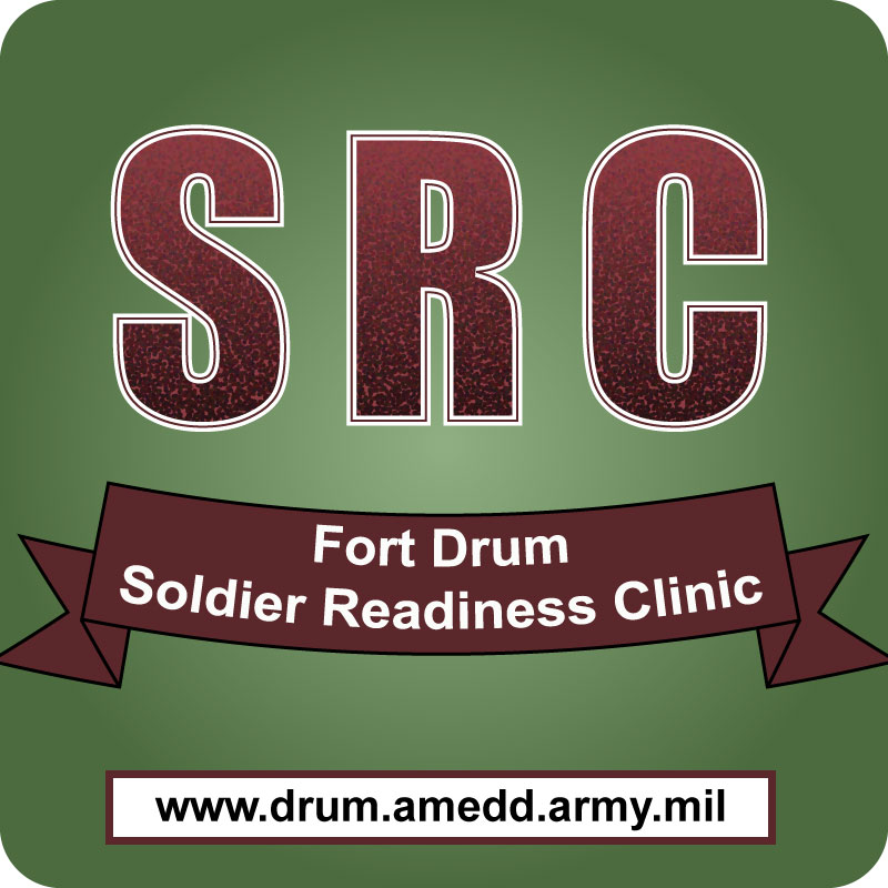
So, I decided to save this logo as DRAFT1 and make some changes. I got rid of the lower banner and replaced it with a rectangle box of the same color with the web address in it. I also scaled up the vertical size of the upper banner and put the words “Fort Drum” on top of “Soldier Readiness Clinic” and added a -15% arch to that banner.
All in all, I’m not sure which banner I would go with for my final design. That’s where I’m hoping feedback will help. Looking at my draft designs, I can tell they’re not where I want them to be, but I’m not sure where to go from here. I can use all the help I can get; so, please feel free to give me as much feedback and criticism as possible.


Dear Warren,
I really like your use of complementary colors red and green. You did a truly unique design with the letters SRC, creating a different texture for the image.
Have you explored removing the border line of the banner to create a lighter weight to the design. A point of consideration is what do you want the audience to view first in your image. Currently, it seems like all 3 serve an equal importance. Because you have a textured design for the letters, have you considered not creating a gradient for the background so all attention is drawn to the name of the organization.
Another thought is to think about the effectiveness of your logo on something as small as a patch on a t-shirt to a banner. That would affect if you would want your website on your logo. With the banner you were able to achieve a visual symmetrical balance. You also applied the principle of proximity well.
LikeLike
Hi!
I like that you did 2 designs. I am going off of your second logo design. I like your letters and banners. I like the gradient look with the almost glitter look of the “SRS”. I think it stood out and with the background it looks really nice.
My critiques are there are a lot of words on the logo. It has the initials and then the words on the next banner of what they stand for and then also the website. I think if you took off one of those there would be less to read and it would be more of a logo. I also think the colors of the words not the initials could be the same color. With removing one of them that wouldn’t be a problem but if both banners would be there then having them be the same color. I really like your logo design and think you did a great job.
LikeLike
Hi Warren,
Looks like you have a great start on your logo. If I had to pick, I would say the second one has a better balance. I like how you have put the website on the rectangle to set it apart from the name of the clinic and the background. The pointalized gradient effect looks really bold on your “SRC” text and draws the eye to the lettering.
Looking at your sketches, I like the idea of including the medical cross into your design in some way. I wonder if you could use the medical cross as the platform for your information on the organization. Essentially, you could make the cross the background for the words, and just simplify it to using the “SRC” on the cross. I can also see your background as a flag or a single star, or even a star with flag colors. Something that I kept asking myself as I was creating, “what will this look like as a tiny icon on a cell phone”. It’s amazing how much detail you lose when you shrink it that small!
Nice work, I look forward to your final product.
LikeLike
My Self Critique
This assignment has definitely been a lot more challenging than the Photoshop assignment. I felt very comfortable creating a design in Photoshop because I have a lot of experience using Photoshop and with that project, I was able to use outside elements to incorporate into my design. For this design, I had to create everything from scratch, using a program I only began working with a week prior. I do think the tutorials helped me with my design as they gave me a better understanding of how to use Illustrator. As I began working with the program and playing around with various elements, I began to become more comfortable with the process. I’m not 100 percent happy with my initial drafts as they really don’t feel like professional designs yet. However, I think with a little more work and some constructive feedback from my peers, my final product will be something of which I can be proud.
LikeLike
Hi Warren,
I think the Army comes through in this logo and the colors, especially the green really makes the point. I appreciate that you included two versions and that you provided a photo of your process to illustrate how you came to this design. It is notable that you made good use of the techniques we learned to put some great touches into your design. In total I think design one is the best and I would carry over the gradient in SRC from the second draft into the first.
I have a couple minor design suggestions such as, I think the entire design might benefit from a frame or border to close the logo and give it permanence. The other is to maybe to include a heart in the logo, to give the health reference more prominence. The look is professional and easy to read and with a couple tweaks I think you will be there.
Thank you,
Evan
LikeLike